Gone are the days of yore when people would pride themselves on their penmanship. I too must attest that my lettering is no better than that of a common riff raff, much like the rapper Riff Raff’s facial hair.
While one’s handwriting may not directly relate to ironing, it does increase one’s personal style points (or aura points for the youth). Alas, there is a more self-indulging reason for this lesson: I simply wish to include cursive script within some of my designs. I find that script adds that je ne sais quoi that print simply lacks.
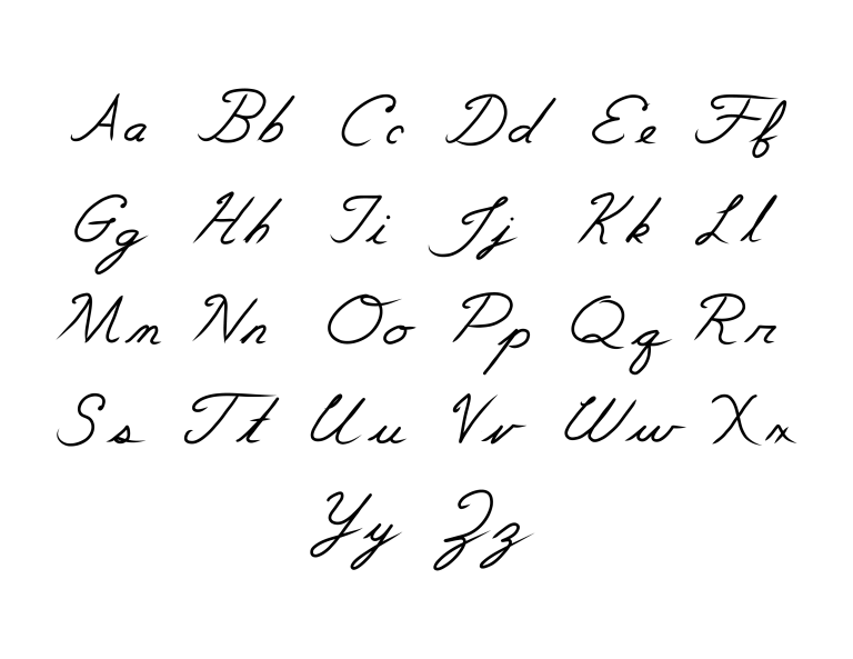
So, gather round, youngins, and let’s learn together. Keep in mind, handwriting is an art, and in turn, people will have their own variations. Below is my version of the English alphabet.
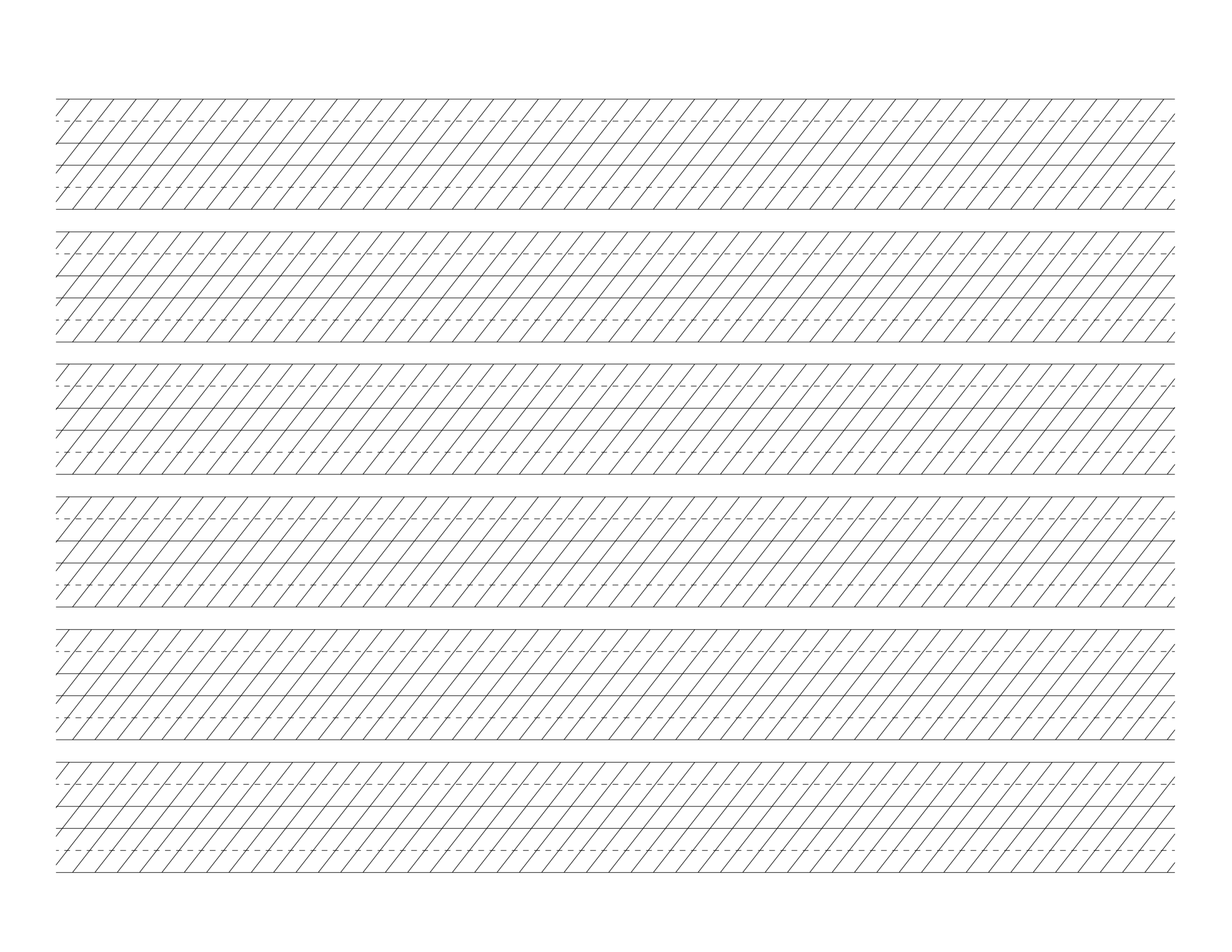
Let’s dive deeper and look at the construction of the letters. To do so we will first start off by building guidelines to help determine the letters’ height, proportion and slant. Traditional calligraphy scripts have set rules so your guidelines may vary for each font type, but they will still follow the same basic components.
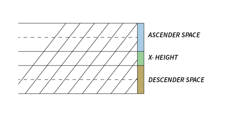
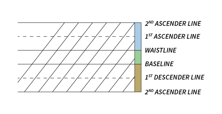
Guidelines have a baseline, waistline, ascender space, and a descender space. The baseline and waistline combine to make up the x-height, which denotes the height of the short lowercase letters, such as x. most of the letters will sit on the baseline and extend up to the waistline. The ascender space is occupied by letters that extend upwards past the waistline (ascending stem loop), such as b, h, k, and so forth. Whereas the descender space is occupied by letter that extend downward below the baseline (descending stem loop), such as g, y, j and so on.
Guidelines also include slant lines. These slant lines will vary from script to script but typically range from 45º to 75º. These lines help to create uniform strokes while also giving the script a sense of rhythm.
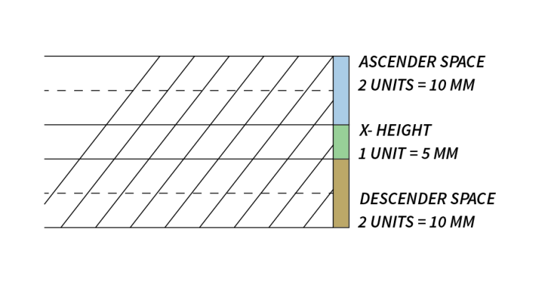
Copperplate script has a ratio of 2:1:2 when looking that the ratio for ascender space:x-height:descender space. This ratio can change depending on your script preference. When determining your proper x-height you may want to consider the width if the nib on your pen (the part that touches the paper); however, for simplicity I will use an x-height of 5 millimeters (mm). Thus with our desired ratio both the ascender space and the descender space will me 10 mm.
Now that we have finally built our guidelines, it’s time for you to practice your script so that you too can one day impress the youth with your penmanship.